Accessibility Testing Websites
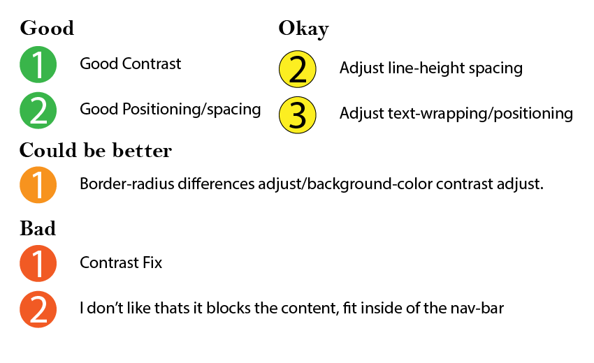
I used these websites to test accessibility. There wasn’t much to report in terms of issues other than some contrast, which I commented on.
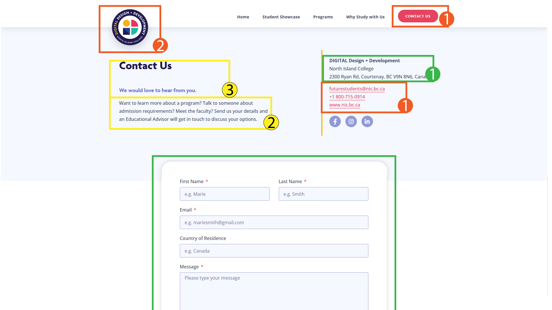
Contract Issues recommend setting colour from #E54360 to #9F1436
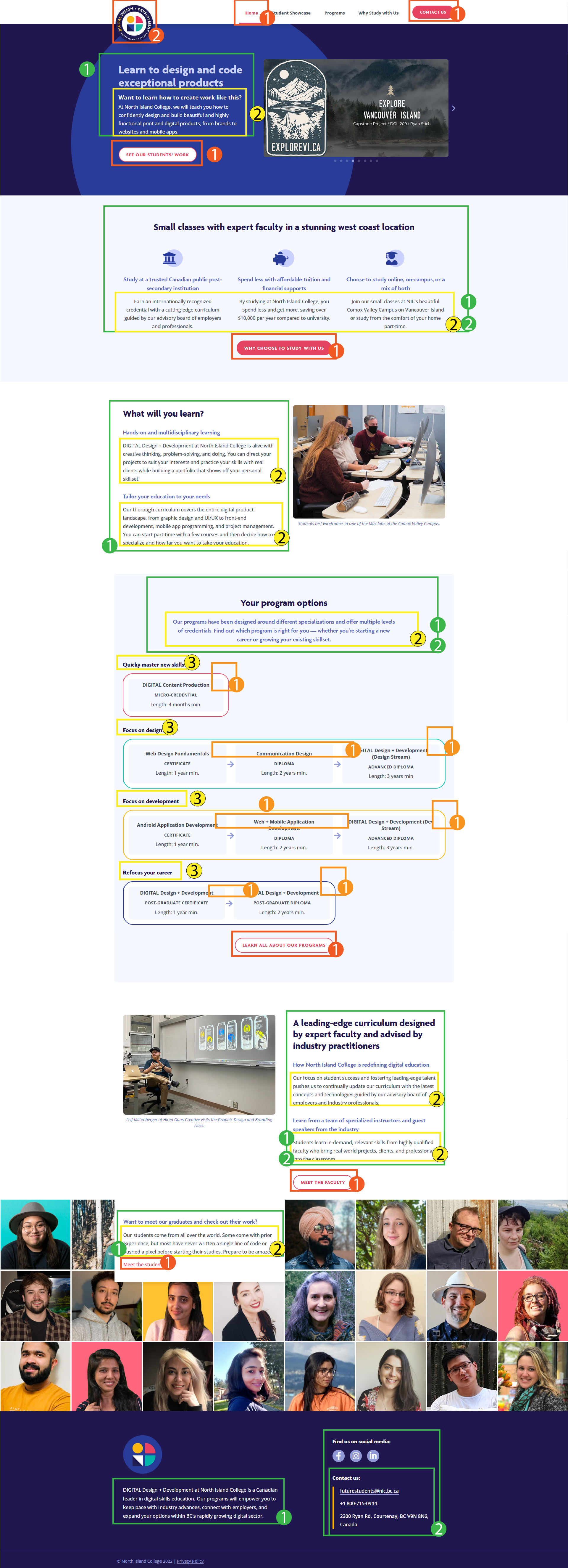
For the line-height on the desktop site, recommend adjusting it so it’s slightly more spaced out between each line.
For the logo, I recommend setting its height to 90% of the nav bar.
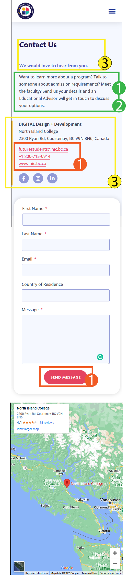
For the mobile site, I recommend making the text-align element at the center of the page, especially for headers.
For the border-radius inside program options I recommend setting each child and parent element to the same radius.
For each element in the program options, I recommend upping the contrast for better visibility.
Overall, I give the website a 4.2/5
Why a 4.2? Because it sounds more thoughtful than a 4 / 4.5, and I also think it is between it.